Showing posts with label art. Show all posts

Tuesday, August 27, 2013

Guest Feature: Kelly Galanos from Sycamore Hill


Look what I've received in the mail! Or should I say, what my 11 year-old dog Bubba has!
Super-cool Kelly Galanos from Sycamore Hill makes the most unique hand-stamped metal spoons, silverware, and other goodies. 

Kelly's Etsy store, Sycamore Hill, specializes in selling her awesomely upcycled goods to the masses. A little more about Kelly is below (taken from her Etsy site!)

"A native of Chicagoland, I have lived among the scenic rolling hills of Bluegrass “horse country” for the past ten years. Louisville's charm has grown on me ~ and as an lifelong equestrian, it has been especially sweet for me to be surrounded by everything equine.

Our property sits atop a steep crest and is affectionately named Sycamore Hill. My studio overlooks the century-old tree, after which the property is named. I have quite an incredible view! My time away from the Hill is largely spent with my horse, Monty, at his stables just outside of historic downtown LaGrange, Kentucky."


What I received was from her Pet Tags collection. A perfectly personalized set of dog tags for my Bubba! The BOHO tag for his name piece. So much chicer (and meaningful!) than just any tag you buy at a pet store! What's great about Kelly's store is that you can completely personalize the tag; shape, font, font size, and even color of the metal. 


Then, of course, a "Call My People" tag to complete the identification set. I just love the handmade quality of these, that they are made by a caring individual, not a machine! All my readers know how I emphasize the DIY lifestyle, and Kelly definitely embodies this lifestyle!


In addition to her pet tags, she's got hand-stamped silverware (which still function as silverware!) , good-luck horseshoes, and key fobs and tags. These are super-cute gifts and can also be personalized to convey a message. Birthday parties, wedding gifts, congratulations gifts,....the list goes on and on. Truly special! 


Needless to say, Bubba loves his tags. Looking dapper!

Follow Kelly on Twitter, and like her on Facebook for updates!


All photos copyright Allison Beth Cooling.

Thursday, August 15, 2013

Tips for Bokeh Photography

"Bar Study" copyright Allison Beth Cooling
*Instructions below for using a DSLR camera. I have a Canon Rebel T3i. Instructions may have to be altered a bit depending on your camera*

Here is a little break from my usual jewelry tutorials (I am an "art blogger", and art incorporates other facets than just jewelry!)........ One great form of art is photography; a picture really truly is worth a thousand words. I love how photographs can capture a certain mood, time, feeling, state of being, stage of life. Just like how powerful photojournalists' images can be, and how influential these images are within history, photography is a form of art which is much more conceptual and deeper than just taking a picture of a pretty flower.

Sure, a pretty flower makes for a very pretty photograph, which is totally fine. I love taking pictures of this kind, but also push myself to take more conceptual, abstract, meaningful images. Photography can span a ton of different styles, and trying each style out can really help you grow as an artist. 


Night Post. Image copyright Allison Beth Cooling

This post will teach a little about Bokeh photography. Bokeh means blur, and references a style of photography focusing on blurred (whether partially or completely) images. In college I learned about famous photographer Uta Barth; her whole style focused on Bokeh, sort of capturing "air" instead of focusing on the subject. All of her images have a very minimalistic, dreamlike quality to them, abstracted to where you can't really tell what the scene actually is. I think this is why this style is very thought-provoking; it tempts the onlooker to search for a deeper meaning, rather than just looking at a pretty flower. 
The technique I use for getting Bokeh images is actually really simple, and instantly gratifying. The hardest part is going to be deciding on how blurred you want your image, and adjusting accordingly. Once you get the hang of it, it's easy!


Exhibit A:
The image you see on your left is the normal picture. A pretty cafe in Estero, FL  from when I went to Miami earlier this summer. This cafe set is about 25 feet away from me. 
To get the middle picture (slight blur): Point your camera at your feet, and press the shutter halfway down to focus; then, with your finger still pressing halfway down, bring your camera up at your subject; it should be blurry in your viewfinder, and press it all the way down to take the image. Depending on how far away your subject matter is, the amount of blur will vary.
To get the full blur (very Uta Barth like!) put your hand about a foot in front of your camera lens, and press halfway down to focus. Simply keep the button halfway down, point at your subject, and take the shot! This will give you much more of a blur.
The closer the object is you set your focus to, the blurrier the image will be.


Another example; the left shows a full blur (with the hand technique) and the right shows a small blur (focusing on the ground). I was standing a lot farther away from these trees, about 40 feet or so. You can see that the small blur image is less than the cafe picture above. This is because the image is farther away; scenes farther away from you will require focusing on your hand to get the full blur.

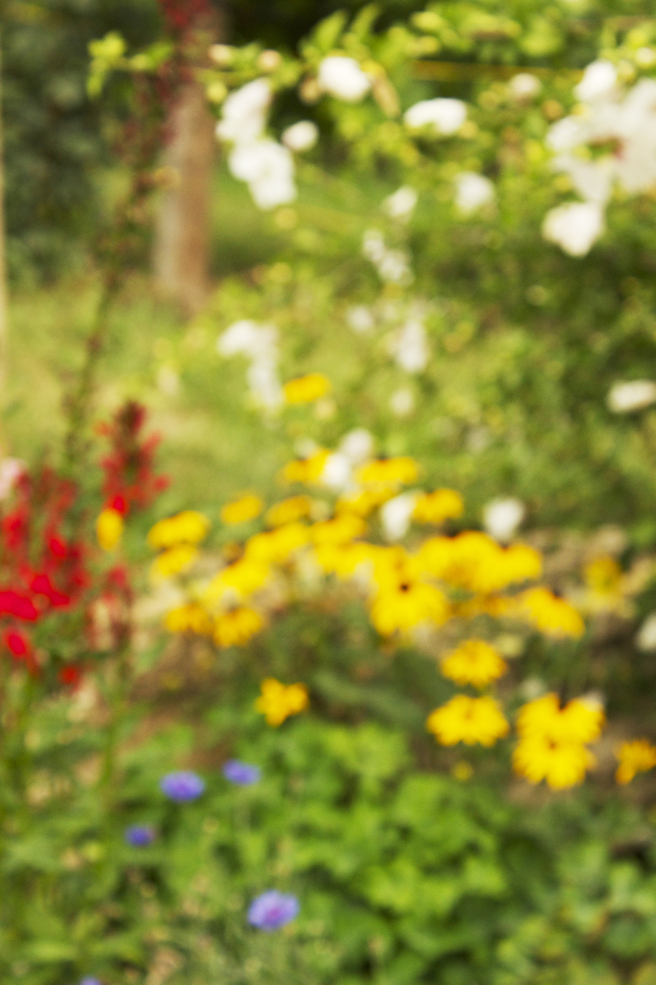
Some scenes will lend themselves better to Bokeh than others. It's always good to experiment! This is a flower garden scene. I'm not a big fan; it just isn't abstract enough, and there are too many of the same scale figures, and not enough contrast.


Scenes that work better involve variances in scale, color, value. Or, images where Bokeh will help push forth an idea. Here, I use palm trees and abstracted them with Bokeh to give a dreamy feeling, like how I wish I lived someplace tropical! 


This image was turned to a black and white, beacause Boken images lend themselves very well to black and white versions. Just make sure that there is a lot of value contrast (the lightness/darkness of the image, not necessarily the colors). View this example below:


The color version is cool, but the black and white, to me, seems more elegant and abstracted, in a way. This will be up to you to determine how you want to go about making your final photo!
I simply applied the Black/White Adjustment Layer in Photoshop to create these images. It is the easiest way to do so! 
One more example is below:


Again, I like the color version, but prefer the black and white.
Hope this was helpful! The best way to test this out is to just experiment, and find what works best for you. With abstract photography, there is no right or wrong answer! If you like to print up your photos, these Bokeh abstracts work really well as large wall prints. It enhances the airy, dreamy feel, and gets the message across better. I would recommend using some of your favorites as wall art/canvas prints to style your house or apartment! It's always better to have your work in your space instead of something you bought at Ikea!

All images here copyright Allison Beth Cooling. Do not use or copy please.


Monday, August 5, 2013

Color Monday: Shell Happy Palette


A cute color combination of primaries and neutrals to make for a quite kitschy feel!
Feel free to use this color palette in any of your art projects.

Wednesday, July 3, 2013

Americana Nail Tutorial- Happy 4th!


In honor of the Fourth of July, I decided to post an easy nail tutorial that everyone will love!


These Americana Nails are great because the color can be changed to fit any theme, or outfit. By using striping tape, it gets rid of the need to paint super-straignt lines, which is basically impossible!
Instead of red, white and blue, try black with neon tape for a cool effect, or even a mix of monochromatic elements will be subtly sweet!
I'm sure if you show up with this manicure at the holiday party or barbecue, everyone will be talking about it!
Let's get started.


Step 1: Gather materials. Needed are scissors, a dotting tool or toothpick, striping tape (you can find at beauty supply stores or Ebay or Etsy), nail gems, and nail polish including top coat.


Step 2: Paint your nails blue and red, alternating. Get your white striping tape ready...


Press down one end of the tape right against the edge of your nail. Pull the tape as you press it against your nail, on a diagnol to the other side of your nail. Cut the tape right against the edge of your nail; if it hangs off, it won't adhere! Continue with this, taping all of your nails.


Step 3: Repeat the process, but adding a stripe in the other diagonal direction to form an X.  When you have completed the X on all your nails, paint with a topcoat and QUICKLY press a nail gem right above the cross in the X. Press down firmly to adhere the gem. It does help if you paint over the entire nail again with clear coat, to adhere the gem. However, the gem will get a bit glossy. If you don't want that paint over again with clear coat, right up the the edges of the gem but not over it.
That's about it! 


These really make an impact on any outfit!


If you share/use/post this tutorial, please link back to me. It is much appreciated! Don't use my photos without crediting me please!


Sunday, June 23, 2013

Day 7: So Long SoBe and Free Cloud Background


Last day of Miami....


I'd figure I'd post some pics of the architecture!


South Beach has a cool art deco style that is definitely very inspirational for all types of artists alike!


I took about 300 pictures in one day!


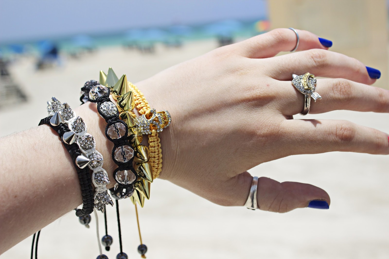
Of course, I had to post some pics of my accessories as well. Here, I wear my Midi Ring  along with rings from Generation Bliss. The bracelets are: top, my own (tutorial may come soon), and last two from So Good Miami.


Ring (middle) from Juicy Couture, pinkie ring my Midi Ring, thumb, vintage, bracelets from So Good Miami, ASOS, and Ebay.


And just to say farewell, here is a free cloudscape; feel free to use in any digital art project you have! Image is 72 dpi for web use. Click to download.


Tuesday, June 18, 2013

Day 3: Photo Journaling and Photo Tips


Today was a day of sightseeing.


Of course that included some cool shades.


And palm trees, AGAIN.


Some glitz (here, rings from Generation Bliss) and of course, Chanel shoes.


And as always, coffee; here is a latte with soy milk!

Some tips for taking travel photography:
1. Focus on the small things. Instead of trying to get the WHOLE scene, focus on one item that's the most interesting. Your photos will be unique. Anyone can take a picture of a beach coastline. Try to find a unique spin in your image, maybe by tilting the horizon, or using bokeh (see tip 3)

2. Set the mood with the color. It's easy to use Photoshop to change colors; me changing the color on the coffee picture from the dull brown it was to pure black and white makes for a more sophisticated picture. Think about the mood you want to convey.

3. Bokeh images. Like the palm tree image above, I love bokeh photography. It really gives all your photos an artistic vibe, and makes them more interesting to look at. Some great tutorials are on the net, but I've found that they make the technique seem harder than it is. All you have to do is put your hand about a foot in front of your camera lens, press the shutter halfway down to focus (on a Canon, or focus however your camera does if other brand), and then point your camera at your subject; it should be blurry in the viewfinder. Take the picture! If it is too blurry, try to focus on something a couple feet away, say like a tree trunk or light post. Then find the subject and take the picture. The amount of blur will depend on how far you are away from your first focusing subject, then the real subject you take your image of. The best way to judge is to just practice!

4. Document specific things. Specific outfits, accessories, places, things that are unique to that place or your situation. I love posting a mix of what I am wearing, eating/drinking, and seeing to form a full snapshot of the time!

There you have it, some simple tips!


All photos copyright Allison Beth Cooling. DO NOT use these images without linking back or giving credit to me! 


Monday, June 3, 2013

Color Monday: Petal Play Palette


Inspired by tropical flowers, this palette has contrasting greens and red/pink hues, set off by black. Very sophisticated yet feminine! Feel free to use this palette in any of your art projects.

Monday, May 20, 2013

Color Monday: Rooibos Palette


The deep reds and oranges of tea leaves, plus green for contrast. A very warm yet calm palette!
Feel free to use these colors in any art project you have!

Monday, April 29, 2013

Color Monday: Stucco Says


A palette inspired by a stucco building wish Spanish flair. Complimentary blue and oranges mix with darker black. Feel free to use in any art project you have.