 |
| "Bar Study" copyright Allison Beth Cooling |
*Instructions below for using a DSLR camera. I have a Canon Rebel T3i. Instructions may have to be altered a bit depending on your camera*
Here is a little break from my usual jewelry tutorials (I am an "art blogger", and art incorporates other facets than just jewelry!)........ One great form of art is photography; a picture really truly is worth a thousand words. I love how photographs can capture a certain mood, time, feeling, state of being, stage of life. Just like how powerful photojournalists' images can be, and how influential these images are within history, photography is a form of art which is much more conceptual and deeper than just taking a picture of a pretty flower.
Sure, a pretty flower makes for a very pretty photograph, which is totally fine. I love taking pictures of this kind, but also push myself to take more conceptual, abstract, meaningful images. Photography can span a ton of different styles, and trying each style out can really help you grow as an artist.
 |
| Night Post. Image copyright Allison Beth Cooling |
This post will teach a little about Bokeh photography. Bokeh means blur, and references a style of photography focusing on blurred (whether partially or completely) images. In college I learned about famous photographer Uta Barth; her whole style focused on Bokeh, sort of capturing "air" instead of focusing on the subject. All of her images have a very minimalistic, dreamlike quality to them, abstracted to where you can't really tell what the scene actually is. I think this is why this style is very thought-provoking; it tempts the onlooker to search for a deeper meaning, rather than just looking at a pretty flower.
The technique I use for getting Bokeh images is actually really simple, and instantly gratifying. The hardest part is going to be deciding on how blurred you want your image, and adjusting accordingly. Once you get the hang of it, it's easy!

Exhibit A:
The image you see on your left is the normal picture. A pretty cafe in Estero, FL from when I went to Miami earlier this summer. This cafe set is about 25 feet away from me.
To get the middle picture (slight blur): Point your camera at your feet, and press the shutter halfway down to focus; then, with your finger still pressing halfway down, bring your camera up at your subject; it should be blurry in your viewfinder, and press it all the way down to take the image. Depending on how far away your subject matter is, the amount of blur will vary.
To get the full blur (very Uta Barth like!) put your hand about a foot in front of your camera lens, and press halfway down to focus. Simply keep the button halfway down, point at your subject, and take the shot! This will give you much more of a blur.
The closer the object is you set your focus to, the blurrier the image will be.


Another example; the left shows a full blur (with the hand technique) and the right shows a small blur (focusing on the ground). I was standing a lot farther away from these trees, about 40 feet or so. You can see that the small blur image is less than the cafe picture above. This is because the image is farther away; scenes farther away from you will require focusing on your hand to get the full blur.
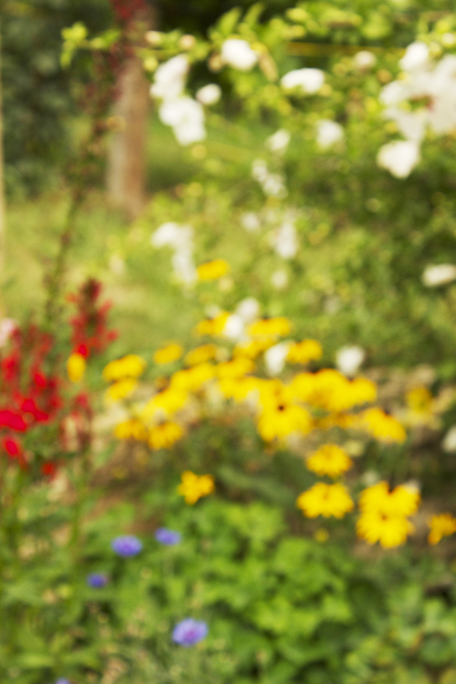
Some scenes will lend themselves better to Bokeh than others. It's always good to experiment! This is a flower garden scene. I'm not a big fan; it just isn't abstract enough, and there are too many of the same scale figures, and not enough contrast.
Scenes that work better involve variances in scale, color, value. Or, images where Bokeh will help push forth an idea. Here, I use palm trees and abstracted them with Bokeh to give a dreamy feeling, like how I wish I lived someplace tropical!

This image was turned to a black and white, beacause Boken images lend themselves very well to black and white versions. Just make sure that there is a lot of value contrast (the lightness/darkness of the image, not necessarily the colors). View this example below:


The color version is cool, but the black and white, to me, seems more elegant and abstracted, in a way. This will be up to you to determine how you want to go about making your final photo!
I simply applied the Black/White Adjustment Layer in Photoshop to create these images. It is the easiest way to do so!
One more example is below:

Again, I like the color version, but prefer the black and white.
Hope this was helpful! The best way to test this out is to just experiment, and find what works best for you. With abstract photography, there is no right or wrong answer! If you like to print up your photos, these Bokeh abstracts work really well as large wall prints. It enhances the airy, dreamy feel, and gets the message across better. I would recommend using some of your favorites as wall art/canvas prints to style your house or apartment! It's always better to have your work in your space instead of something you bought at Ikea!
All images here copyright Allison Beth Cooling. Do not use or copy please.
No comments:
Post a Comment